

What makes a good YouTube thumbnail for a business channel?
What Makes A Good YouTube Thumbnail For A Business Channel comes down to three things: it makes the video’s value clear at a glance, speaks to the right viewer, and gives that viewer an accurate reason to click. A strong thumbnail doesn’t just look good. It helps someone decide, in a second or two, whether your video is relevant to their problem, goal, or purchase decision.
That matters because thumbnails shape first impressions and strongly influence the click-through decision. Your click-through rate, or CTR, is the percentage of impressions that turn into views. Impresiones are the times YouTube shows your thumbnail in eligible places, such as Home, Search, or Suggested. A good YouTube thumbnail for business is not flashy design by itself. It’s clear communication that earns relevant clicks.
When your thumbnail attracts viewers who are actually a good fit for the video, it can support better engagement and visibility. Not because a thumbnail guarantees reach, but because it helps the right people start watching. If the video then holds attention, YouTube gets a stronger signal that the packaging and the content match. Effective business thumbnail design is accuracy with appeal, not hype with disappointment.
- Show one clear idea so viewers understand the topic fast.
- Match the audience by reflecting their problem, industry, or goal.
- Design for mobile because many viewers first see thumbnails at a small size.
- Align with the title so both pieces work together instead of repeating each other.
- Keep branding consistent with a recognizable color palette, logo use, font style, and layout.
- Use honest visual teasers that preview what the video really covers.
- Test variations and review CTR, retention, and impressions in YouTube Studio.
For a business channel, the bar is a little different than for entertainment content. You usually need to signal usefulness, trust, and relevance to a specific type of viewer. A consultant might use a close crop of a chart, dashboard, or client scenario. A local service business might feature the job result, not a generic smiling stock photo. If a thumbnail could belong to any channel in any niche, it’s usually too vague to do its job well.
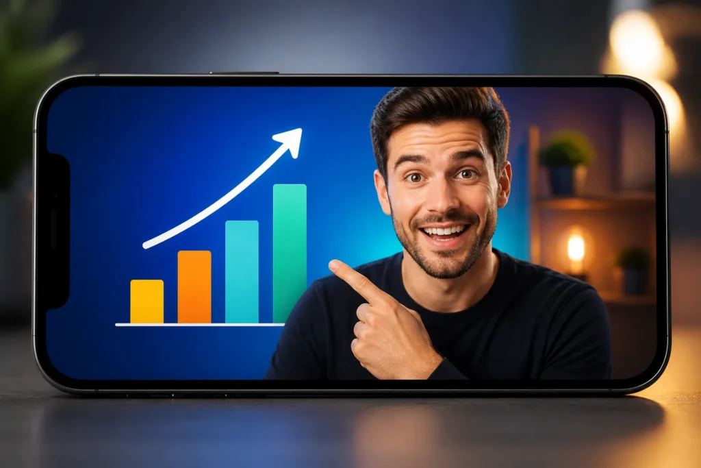

How should you plan a thumbnail for your business video?
Thumbnail planning works best as a simple sequence, not a last-minute design task. Start before you open your editing tool. If you skip the planning step, you usually end up with a thumbnail that looks polished but says very little.
- Identify the intended viewer. Ask who this video is for right now. Is it a small business owner, a local customer, a coach, or a marketing manager? A strong YouTube thumbnail starts with audience recognition. If you don’t know who should click, you can’t choose the right image or message.
- Choose the main benefit. Pick one useful outcome the viewer will get from watching. Not five. One. Examples include fixing a tax mistake, comparing ad formats, or learning a product feature.
- Select one visual idea. Use a single image concept that previews the value. This is where visual teasers help. An honest teaser could be a before-and-after setup, a close-up of the feature being explained, or a visible problem the video solves.
- Check the match with the title. The title and thumbnail should support each other. They should not repeat the same words line for line, and they should never make a promise the video doesn’t fulfill.
This is also where you should reflect your business’s value proposition. A local accounting firm should show something tied to tax planning, bookkeeping cleanup, or filing mistakes. A generic office photo says almost nothing. A clearer option would be a tax form, calculator, or a simple graphic showing a costly error being corrected. The right YouTube thumbnail for a brand is relevance that your target viewer can recognize instantly.
Think about the difference between a broad and specific concept. A video titled How To Prepare For Quarterly Taxes works better with a visible tax document, deadline reminder, or expense category close-up than with a desk, coffee cup, and laptop. The specific image acts as a useful preview. The broad image just fills space.
Keep your teaser honest. If your video demonstrates a tool, show the tool or the result screen. If your video explains a product problem, show the product issue. If your video compares two options, show both clearly. A good business thumbnail is not mystery for the sake of mystery. Curiosity helps, but the viewer should still know what kind of value waits on the other side of the click.
One side note that often confuses creators: the YouTube 8-minute rule is about mid-roll ads on eligible monetized videos. It does not control thumbnail design, dimensions, or upload settings. Keep it separate in your planning so you don’t solve the wrong problem.

Which images and dimensions work best for YouTube thumbnails?
Usos high-resolution images with one obvious focal point. That could be a face, a product, a chart detail, a finished result, or a key visual from the video. If the viewer has to search the frame to figure out what matters, the image is doing too much. A good YouTube thumbnail for business usually looks simpler than creators expect.
The standard custom thumbnail size is 1280 × pixels with a 16:9 aspect ratio. YouTube also has a 2 MB file-size limit for custom thumbnails. Those are the practical numbers to remember. If your image starts smaller and gets stretched, it often looks soft, muddy, or unreadable on larger screens.
Safe-area choices matter too. Keep essential text, faces, icons, and your brand logo away from the outer edges. Different layouts, recommendations, and device previews can crop or visually crowd the borders. A good rule is simple: place the critical message in the center area so it still reads well at small sizes and across placements. Effective business thumbnail design includes planning for how the image is actually seen, not just how it looks at full size on your monitor.
Your image workflow doesn’t need to be fancy, but it should be intentional:
- Crop tightly so the subject fills more of the frame.
- Remove distractions with basic photo-editing tools.
- Use AI background removal when the original setting is cluttered or irrelevant.
- Choose relevant backgrounds instead of decorative ones that add noise.
- Export cleanly so details stay crisp after upload.
Foreground-background separation is one of the most overlooked parts of thumbnail design. If your subject and background are similar in tone or color, the image collapses into a blur at small sizes. Fix that with background contrast, controlled shadows and highlights, and careful color grading. If needed, isolate the video subject more clearly by darkening the background slightly or adding a soft outline. That kind of video subject isolation helps the eye land fast without making the design look fake.
For example, if you run a product tutorial channel, showing the exact device or product feature often works better than a wide desk scene. A cropped close-up with a relevant background gives the viewer a quicker answer to one question: what is this video about? A strong YouTube thumbnail is often one useful object, one clear result, and no visual clutter competing with the message.


How can you make thumbnail colors and branding consistent?
Use color to improve recognition and clarity, not to chase brightness for its own sake. Strong thumbnails often use vibrant colors, but that does not mean every business video should look neon. The right YouTube thumbnail for a brand is color that fits your brand, fits the subject, and helps the main element stand out fast.
Start with basic image adjustments. Increase brightness, contrast, and saturation carefully so the subject is distinct. The goal is separation and readability, not an unnatural look. If skin tones look orange, product colors look inaccurate, or screenshots look crushed, you’ve gone too far. For business channels, trust matters. Viewers should feel the image is polished, not manipulated.
Then build consistency across videos with a repeatable visual system:
- Choose a consistent color palette that appears across most thumbnails.
- Place your brand logo in a predictable spot when it adds recognition without crowding the design.
- Keep font style and layout consistency so related videos look connected.
- Repeat a few structures such as left-aligned subject with right-side text, or top banner plus product close-up.
This kind of consistency improves audience recognition. A regular viewer should start to recognize your videos before they read the channel name. That matters for a business channel because trust builds through repeated signals. A good business thumbnail is not perfect uniformity. It’s recognizable packaging that still gives each video its own clear idea.
Thumbnail templates can save a lot of time. Create one or two base layouts for tutorials, one for comparisons, and one for case-study style videos. Then change the main image, background, and any short text so each video still feels specific. A useful example: a software training business could keep the logo in the top corner and the text area in the same place for every upload, while switching the screen image, color accent, or result shown for each lesson. A good YouTube thumbnail for business is a branded framework with room for variety, not one rigid template pasted onto every topic.

How do you keep thumbnail text readable on mobile?
Keep text short and make the image do more of the work. A thumbnail is not a flyer. If viewers need to read a sentence to understand the topic, the design is carrying too much verbal weight. Effective business thumbnail design on mobile is quick recognition, not dense copy.
Use text only to reinforce the visual idea. Remove any word a viewer can already infer from the image or title. If the title is Google Ads Video Campaign Setup and the image clearly shows the campaign screen, your thumbnail text does not need to repeat all of that. A shorter phrase like Setup Fix or Skip This Mistake may do more work, provided the video truly covers that angle.
For better mobile-screen readability, use:
- Bold fonts instead of thin or decorative ones.
- Clear text hierarchy so the most important word is largest.
- Short thumbnail copy with only essential words.
- Strong separation between letters and the background through contrast, shadows, or a solid shape.
Then do a real check. Shrink the design to a small phone-sized preview and ask two questions: can you identify the main image right away, and can you read the essential words without zooming? If not, simplify. Enlarge the subject. Cut words. Increase contrast. A strong YouTube thumbnail often becomes obvious once you view it at the size your audience actually sees.
Accessibility matters here too. Use strong color contrast. Do not rely on color alone to communicate meaning, such as green for good and red for bad without any other cue. Avoid fine, low-contrast text placed over detailed backgrounds. If someone has low vision or reduced color perception, the main point should still come through. The right YouTube thumbnail for a brand includes readability for more viewers, not just viewers with large screens and perfect eyesight.
A simple review method works well: switch your screen brightness down, glance at the thumbnail from a short distance, and ask whether the message survives without subtle color differences. If the answer is no, the thumbnail likely needs a stronger subject, simpler text, or cleaner background separation.
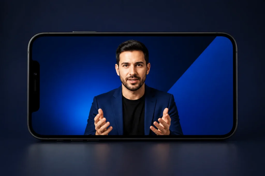

How can you use focal points, callouts, and social proof?
A thumbnail should usually have one dominant focal point. One. That focal point can be a face, product, result, interface detail, or problem area. If two or three things compete equally, the viewer has to decode the layout instead of understanding it. A good business thumbnail is fast comprehension, and a single focal point is the easiest way to get there.
You can strengthen that focal point with tight cropping, background contrast, and light use of overlays. A subtle arrow, circle, or label can help if it directs attention to the exact feature being explained. But use those tools sparingly. Too many shapes, stickers, badges, and text blocks make the thumbnail crowded, especially on mobile.
Callouts y social proof are optional. Use them only when they clarify the video’s value. A short callout like New Feature, Antes, or Local SEO Fix can work if it adds context. A proof point can help too, but it must be accurate and relevant. If the video is about a product walkthrough, showing the product feature being tested is usually stronger than pasting a generic badge with no clear connection. A good YouTube thumbnail for business is useful evidence, not decorative authority signals.
There’s a clear line between an honest teaser and misleading clickbait. A useful visual teaser creates curiosity by previewing a real part of the video. Misleading clickbait implies a result, reaction, or reveal that the video never delivers. If your product demo tests one feature, show that feature. Don’t imply a dramatic outcome the video doesn’t show. Effective business thumbnail design is expectation management as much as design.
Example: If you publish a demo on a scheduling tool’s automation feature, your thumbnail could show the exact automation screen with one highlighted trigger. That is honest and specific. A weaker version would show exaggerated revenue graphics or a shocked face that suggests results the video does not prove. When in doubt, remove decorative elements that compete with the subject. If the thumbnail feels crowded at full size, it will feel unreadable at small size.
How can you test and improve thumbnail performance?
Test thumbnails by changing one meaningful element at a time. That could be the main image, the text, the background, or the crop. Keep the title and the video itself unchanged while you compare. If you change everything at once, you won’t know what actually caused the difference. A strong YouTube thumbnail becomes much clearer when you treat design as a learnable system instead of a guess.
If it’s available on your channel, use YouTube Studio’s Test & Compare feature. Its purpose is simple: help you learn which version performs better with your audience. You are not trying to find one universal winner for every niche or every video. You are trying to understand what your viewers respond to on your channel.
Review performance inside Analytics, especially the Reaching tab. Start with these terms:
- Impresiones: how many times YouTube showed your thumbnail in eligible places.
- CTR: the share of those impressions that turned into views.
- Audience retention: how much of the video viewers kept watching after clicking.
CTR matters, but don’t judge a thumbnail on CTR alone. A thumbnail can attract a lot of clicks from the wrong viewers. If retention drops quickly, the packaging may be creating the wrong expectation. For a business channel, attracting the right viewer is usually more valuable than attracting the most curious viewer. The right YouTube thumbnail for a brand is a strong match between the click and the viewing experience.
Use a repeatable process:
- Record the change. Note exactly what you changed, such as face close-up vs product close-up.
- Allow a fair comparison. Give the versions time to gather impressions before deciding.
- Review the metrics together. Look at impressions, CTR, and retention, not just one number.
- Apply the learning. Use the result to improve future thumbnails for similar videos.
If you want outside feedback before making larger channel-wide changes, a free YouTube channel audit from DigiSphere can help you spot recurring packaging issues, especially when titles, thumbnails, and audience fit are out of sync. A good business thumbnail is often easier to diagnose when you review patterns across multiple uploads rather than one isolated video.

What should you do before publishing your next thumbnail?
Run a final checklist before you publish. This keeps you from shipping a thumbnail that looks fine in the editor but weak in the feed. A good YouTube thumbnail for business usually comes down to consistent execution of simple checks.
- Confirm the viewer. Name the person this video is for and make sure the image speaks to that audience.
- Confirm the value proposition. Identify the single benefit or problem solved.
- Match the title. Make sure the thumbnail and title support each other without repeating the same wording or making a promise the video doesn’t fulfill.
- Check the focal point. Make sure one subject clearly dominates the frame.
- Check dimensions and file size. Use × 720, a 16:9 ratio, and stay within YouTube’s MB limit.
- Preview on mobile. Confirm the image and any essential text still make sense at small size.
- Review accessibility. Check contrast, readability, and whether the message still works without relying on subtle color differences.
After publishing, use YouTube Studio Analytics y Test & Compare where available to guide adjustments. Don’t assume one result applies to every topic. A tutorial, product review, local service explainer, and ad strategy video may each need a different visual approach, even on the same channel. Effective business thumbnail design is consistency in process, not sameness in every design.
If you want tailored feedback, you can request a free YouTube channel audit from DigiSphere at digispheresl.com. DigiSphere is led by Michael, a Fiverr Top Rated Seller with 15+ años in digital marketing, 10,000+ completed orders, 5,000+ five-star reviews, and 6,000+ YouTube creators optimized. The agency offers YouTube thumbnail design alongside YouTube Video SEO, Promoción de anuncios de Google Ads en vídeo, YouTube Shorts creation, Social Media Ring video sharing for authority signals, and backlinks. None of that guarantees views or growth, but it can help you make better packaging and promotion decisions based on how YouTube actually works. A strong YouTube thumbnail is clear value, honest expectations, and steady improvement. Publish the purposeful version, study the response, and improve the next one.

Principales puntos a tener en cuenta
- A good business thumbnail makes the video’s value clear fast, fits the intended audience, and sets an accurate expectation for the click.
- Plan thumbnails before design by identifying the viewer, choosing one benefit, selecting one visual idea, and checking alignment with the title.
- Use high-resolution images, × dimensions, a 16:9 aspect ratio, and safe placement for essential text, faces, and logos.
- Keep branding consistent with a repeatable color palette, font style, logo placement, and layout, while still changing the main visual idea for each video.
- Test one thumbnail change at a time in YouTube Studio, then review impressions, CTR, and audience retention together to improve future designs.
Preguntas frecuentes
What is best for YouTube thumbnails?
The best YouTube thumbnails use one clear focal point, high-resolution images, and a message that is easy to understand at a glance. For a business channel, the strongest thumbnail also matches the title and gives the right viewer an honest reason to click.
¿Cuál es la norma mínima de tiempo YouTube?
The 8-minute rule refers to mid-roll ads on eligible monetized videos. It does not affect thumbnail size, thumbnail design, or thumbnail upload settings.
Can ChatGPT make thumbnails for YouTube?
ChatGPT can help you plan thumbnail concepts, write short thumbnail copy, and suggest layout ideas. You still need a design tool or designer to create the actual image, edit photos, and export the final thumbnail.
Is a YouTube thumbnail 1280×720?
Yes. The standard custom YouTube thumbnail size is by pixels with a 16:9 aspect ratio. YouTube also limits custom thumbnail files to MB.
Why does thumbnail CTR matter for a business channel?
CTR matters because it shows how often impressions turn into views after viewers see your thumbnail. For a business channel, a strong CTR is most useful when it comes from the right viewers and is supported by solid audience retention.
Should you put text on every business YouTube thumbnail?
No. Text is optional and should only be used when it strengthens the visual idea. If the image and title already make the topic clear, extra text can make the thumbnail harder to read on mobile.


 English
 Español
 Deutsch
 Français
 Italiano
 العربية